
Close


Article written by Samantha Lim, Senior Marketing Executive
If you've ever worked on a branding project, you've probably come across both a moodboard and a visual identity. And if you're not working in branding every day, it's pretty easy to assume they're essentially the same thing.
Both can have colours, typography, photography, illustrations, textures, and other visual references. Both are meant to give you an idea of how a brand should look and feel. So where exactly does one end and the other begin?
The simplest way to put it is this: a moodboard explores a direction, while a visual identity turns that direction into something a brand can actually own.
A moodboard is usually one of the earlier stages of the creative process. It's a way of bringing a bunch of visual references together to communicate a feeling before the team starts making more concrete design decisions.
Maybe the brief is asking for something warm and nostalgic, modern but approachable, or playful without feeling childish. Instead of trying to explain all of that in words, you can pull together colours, photography, typefaces, packaging, materials, illustrations and even references from outside the category to show what that feeling could look like.
And not everything on the moodboard needs to end up in the final brand.
That's kind of the point.
A photograph of a 1970s kitchen might be there because of the colours. A piece of packaging might be there because of its typography. A piece of artwork might simply capture the right feeling. The moodboard gives everyone something tangible to react to and helps the creative team decide, “Yes, this is the direction we're going in.”
It's exploratory, which means there's still plenty of room to change things.
A visual identity is a different story.
Once the direction has been decided, the question shifts from “What could this brand look like?” to “How does this brand consistently show up?”
This is where you start defining the elements that will make the brand recognisable: the logo, typography, colours, illustration style, photography, graphic devices, layouts and, depending on the brand, even things like motion, packaging and physical spaces.
It's less about creating one beautiful visual and more about building a system that can keep working long after the original branding project is over.
That's also why a visual identity needs to be flexible. A brand might need to look different on a website, a social post, a billboard and a product package, but there should still be something that ties all of those executions together.
In other words, a moodboard gives you a direction. A visual identity gives you a language.
Source: In-House In-Focus
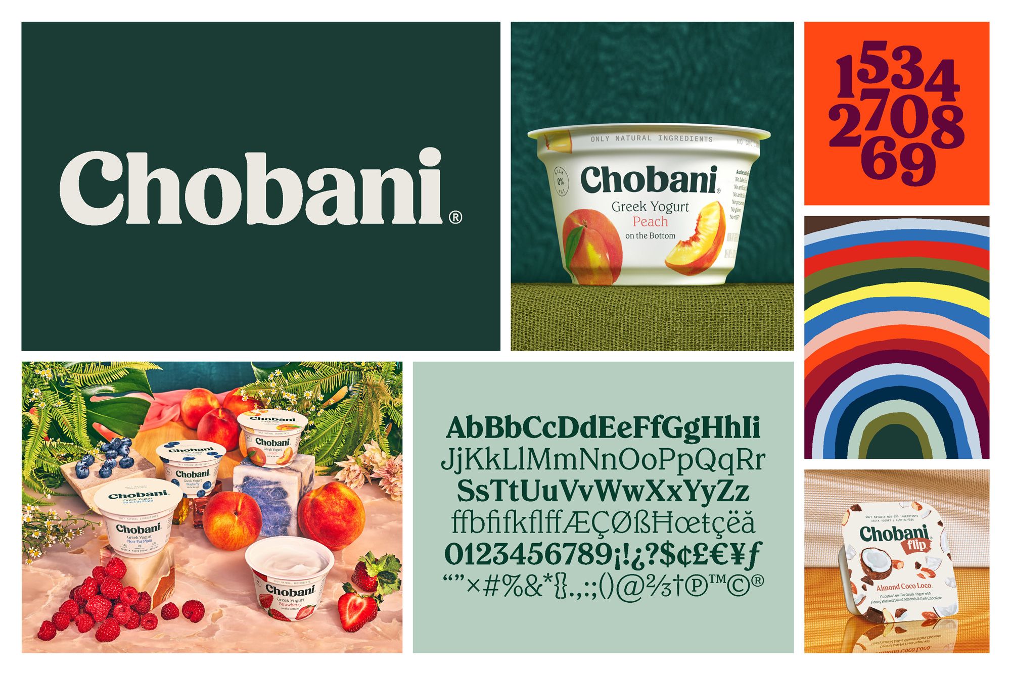
Chobani is a good example of what happens when a creative direction develops into a visual language.
When the brand went through its major visual evolution in 2017, the team led by Chief Creative Officer Leland Maschmeyer and Executive Creative Director Lisa Smith wanted to move Chobani beyond looking like just another yoghurt brand. Their creative thinking centred around the idea of “Happily Ever After”, which eventually evolved into the broader idea of “Fighting for Happily Ever After.”
From there, the team drew inspiration from 18th-century folk art, particularly mid-Atlantic quilt work, as well as the warmth and romance of old fairytale books. The references brought in natural colours, organic forms, handmade qualities, and a sense of charming imperfection.
What makes the Chobani example interesting is that those references didn't simply get copied onto the packaging.
They were translated into a new visual language. The brand moved away from its previous geometric sans-serif wordmark, Broadband, towards a softer and more organic type treatment, while its packaging shifted from stark white towards warmer cream tones and its fruit illustrations became more painterly and deliberately imperfect. None of these individual elements were the identity by themselves. It was the way they worked together, across packaging and communications, that made the new Chobani feel recognisable. The folk art and fairytale references helped define the world Chobani wanted to live in; the visual identity gave the brand a consistent way to express that world.
Source: Smithographic
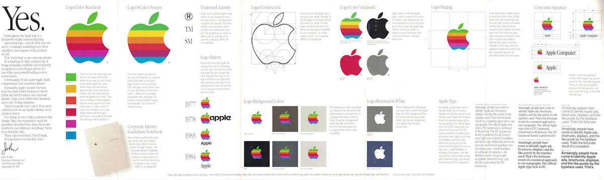
Apple shows a slightly different version of the same idea. Its design history is often discussed alongside Dieter Rams and Braun, particularly because of the shared principles around simplicity, restraint, and functionality.
Jony Ive was an admirer of Rams' work, but it's more accurate to think of this as an influence on Apple's design philosophy rather than Apple simply taking a Braun moodboard and turning it into products. The important part was the thinking behind the work: removing unnecessary elements, making products intuitive and allowing function to influence form. Apple took those principles and developed them into its own design language, which today stretches across its hardware, software, typography, interfaces, and communications.
That's also why a moodboard labelled “Apple” isn't the same thing as Apple's visual identity. You could fill one with white space, clean typography, minimal layouts and sleek product photography, but those are only some of the visual cues associated with the brand. Apple's identity comes from the much broader system behind those choices and the consistency with which they are applied. The same principles can show up in a product launch, an operating system or an advertisement without every execution looking exactly the same. A moodboard can capture an aesthetic, but a visual identity captures the thinking that allows that aesthetic to work repeatedly.
Source: Aesop
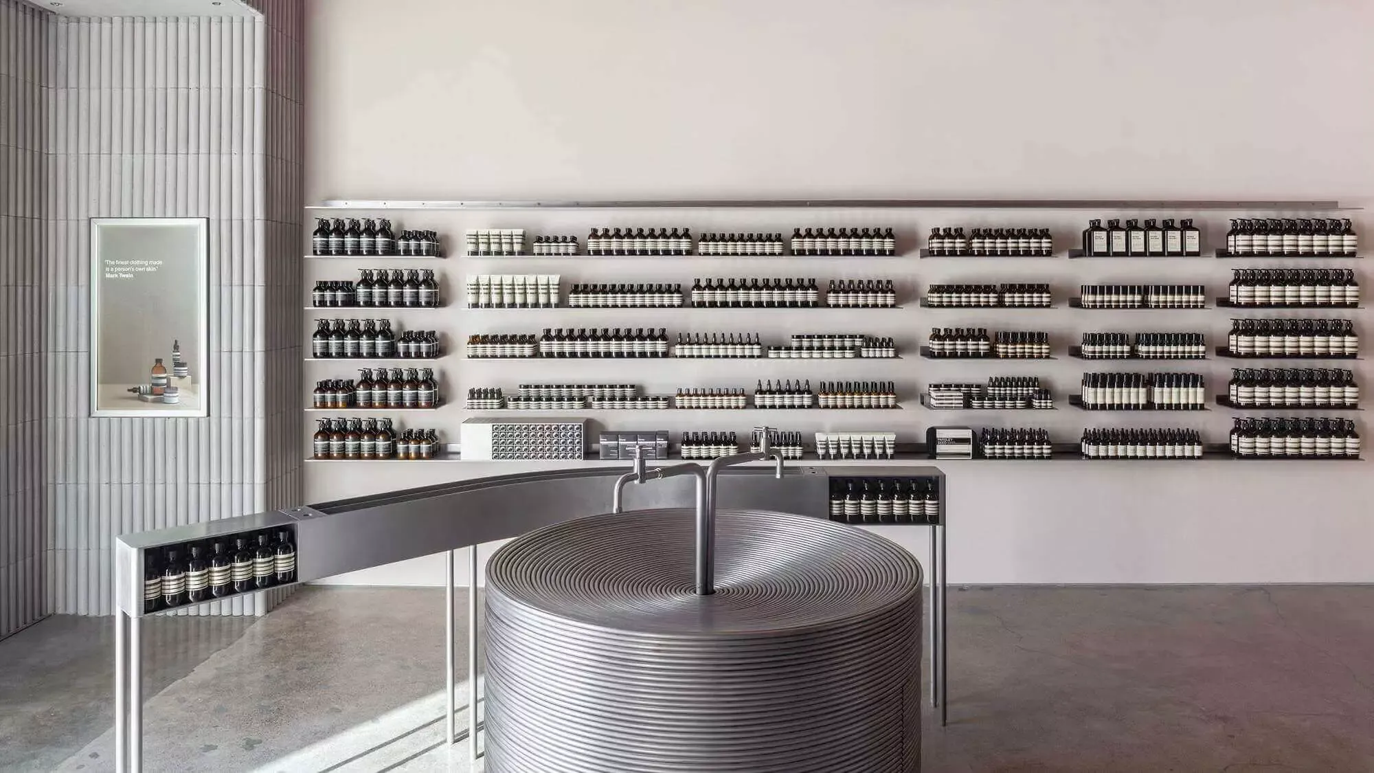
Aesop offers another interesting contrast because its identity is recognisable without being particularly rigid.
The amber bottles, restrained labels and understated typography are some of the most recognisable elements of the brand, but Aesop doesn't simply reproduce the same visual environment everywhere it goes. Its retail spaces are developed with a locally relevant approach, working with architects and designers to respond to the character of each location. At its Corso Magenta store in Milan, for example, DimoreStudio drew inspiration from the functional qualities of a 1930s Italian villa pantry, a reference that made sense for a space where products are stored, prepared and used.
The result doesn't look like a standardised Aesop template, yet it still feels unmistakably Aesop. That's because the brand's identity isn't dependent on making every touchpoint identical. Instead, it has established a set of recognisable principles around materials, functionality, restraint and considered design that can flex depending on the environment. Consistency doesn't necessarily mean sameness, and Aesop is a good example of how a visual identity can give a brand enough structure to remain recognisable while still leaving room for interpretation.
And that's really where the moodboard ends and the visual identity begins. A moodboard can show us “this is the world we're drawn to,” while a visual identity needs to answer “this is how we show up in that world.” It gives designers a framework, marketers a set of recognisable cues and audiences something they can eventually associate with the brand. So the next time you're putting together a moodboard, perhaps the goal isn't just to find a collection of visuals that look good together, but to ask what those references are actually telling you about the brand and how that feeling could be translated into something the brand can truly own.
References:



October 29, 2025

March 11, 2026

March 20, 2026
May 29, 2026

July 27, 2026
August 10, 2026
October 19, 2026

 Thank you for your enquiry! We'll respond shortly.